



Responsive Web Designing

A responsive website gives your visitors a smooth browsing experience across smartphones, tablets, laptops, and desktops. Cany Services OÜ creates responsive websites that automatically adapt to different screen sizes while maintaining a clean design, easy navigation, and consistent brand presentation.

Whether you are building a new website or updating an existing one, our responsive web designing services help your business deliver a professional online experience across modern devices.

Key Advantages of Responsive Web Designing

A responsive website can make your online presence more accessible, user-friendly, and effective. Our team combines modern design principles with practical functionality to create websites that work smoothly across different devices.

Why Businesses Choose Cany Services OÜ for Responsive Web Designing

Here's What We Offer

At Cany Services OÜ, we design responsive websites that combine visual appeal, usability, and performance. Our team creates flexible website layouts that allow visitors to browse your content comfortably, regardless of the device they use.

Mobile-Friendly Web Design

We create websites that look professional and function smoothly on smartphones and tablets, helping mobile visitors navigate your website with ease.
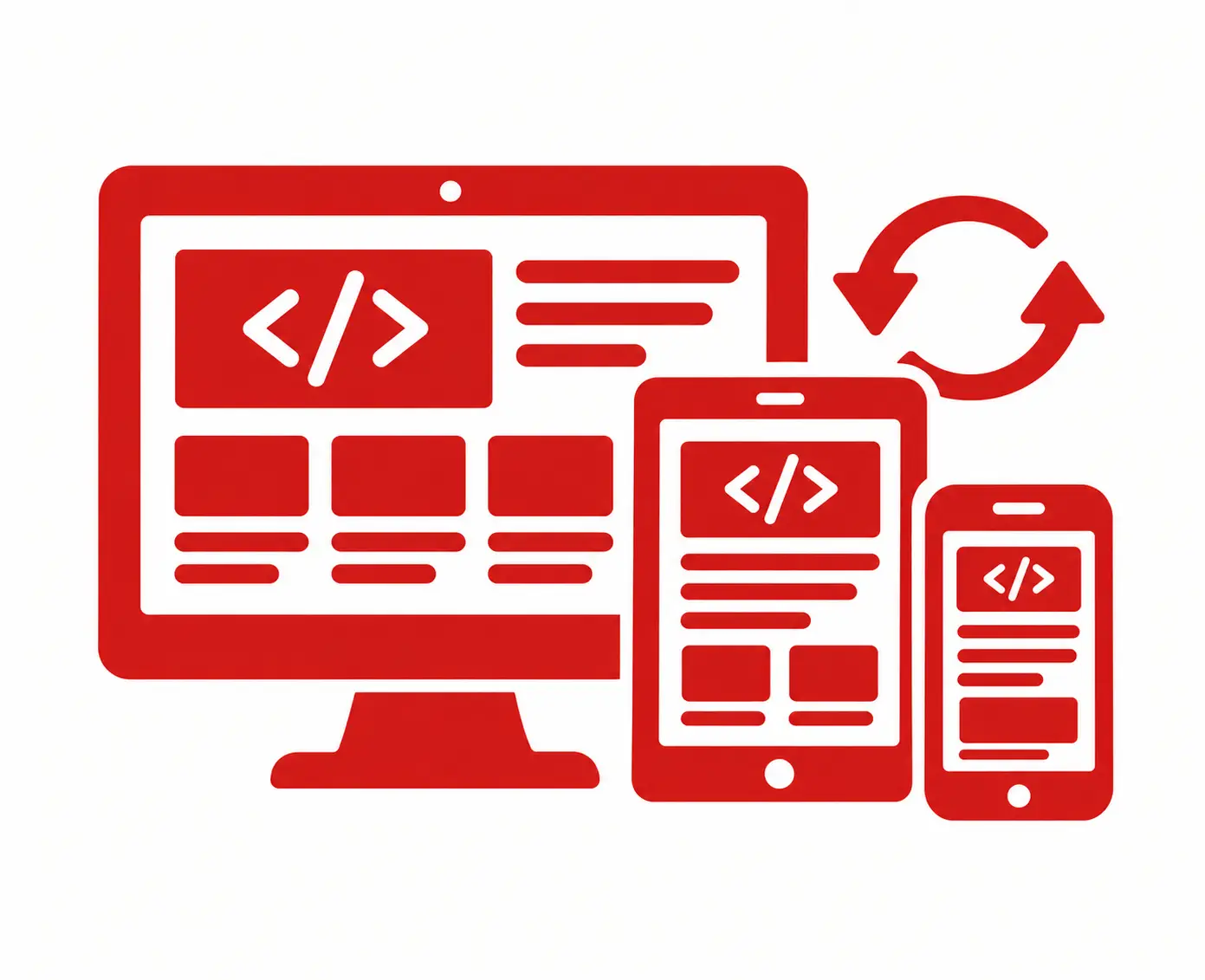
Responsive Website Development

Our responsive development approach allows website elements to adjust naturally to different screen sizes without compromising functionality or design.

User-Friendly Navigation

We organize menus, buttons, content, and page sections in a clear structure so visitors can find important information quickly.
Website Performance Optimization

We focus on efficient layouts and optimized website elements to support faster loading and a smoother browsing experience.

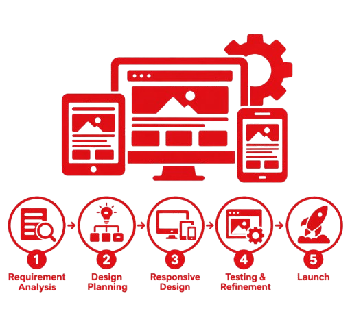
Our Process

Requirement Analysis

We understand your brand, audience, content, and website objectives.

Design Planning

We create a clear layout designed for different screen sizes.

Responsive Design

We develop a flexible interface that works across desktop, tablet, and mobile.

Testing & Refinement

We check layouts, navigation, usability, and performance on different devices.

Launch

After final approval, we prepare your responsive website for launch.
Why It Matters for Your Estonian Audience

Google’s mobile-first indexing means your mobile experience directly affects your search rankings in Estonia and across the EU — a site can have great content, but if the mobile experience is poor, rankings suffer regardless. A responsive site isn’t optional anymore; it’s the foundation of good SEO, good user experience, and good business. Cany Services OÜ builds that foundation right, the first time.

Frequently Asked Questions

Is my website automatically responsive if it looks fine on my phone?
Not necessarily. Many sites appear “fine” on one device but break on others — different screen sizes, browsers, and touch interactions can all expose issues a quick check won’t catch. A proper responsive audit tests across multiple real devices.
Yes. Google uses mobile-first indexing, meaning your mobile experience — not your desktop version — is the primary basis for how your site ranks in Estonia and globally.
Typically 2–6 weeks, depending on the size of the existing site and how much content needs restructuring.
Often, yes — many mobile problems come from a handful of layout or code issues that can be fixed without a full rebuild. We assess this during an initial audit.